

From chaos to consistency: Designing an unofficial design system for Disney+
From chaos to consistency: Designing an unofficial design system for Disney+
duration
duration
3 months
3 months
role
role
Variable & Component Setup, Testing, Documentation
Variable & Component Setup, Testing, Documentation
team
team
3 Product Designers
3 Product Designers
tl'dr
tl'dr
I designed Rafiki, a conceptual design system for Disney+, focused on improving consistency, accessibility, and scalability across the platform. By creating reusable components and clear guidelines, the system helps teams design faster while maintaining a cohesive Disney+ experience.
why does disney+ need a design system?
why does disney+ need a design system?


With that scale comes speed. New features, new markets, new teams — all moving fast, all making decisions independently.
With that scale comes speed. New features, new markets, new teams — all moving fast, all making decisions independently.
At this pace, inconsistency isn't a mistake.
It's inevitable.
the problem
the problem
Inconsistent typography, color, and component styles create an inaccessible interface that feels unpolished.
While deconstructing Disney+ we found a inconsistencies & opportunities of improvement. Let's take a few personas to understand this better from a user POV.


So, how might we standardize elements on Disney+ to make it feel premium while retaining the immersive experience it already offers?
the solution
Introducing Rafiki! It isn't just a component library — it's a shared language for building Disney+ at scale.

our guiding principles
Named after The Lion King's wise guide, Rafiki is the spiritual advisor to Disney+. It's built on five principles drawn from Disney's own mission statement.
🤩
Evoke Emotion First
Design for emotional resonance before information delivery
📖
Champion Storytelling
UI should recede and let content lead
🎨
Enable Creative Freedom
Build systems flexible enough to support unparalleled expression
🧒👵
Accessible to Everyone
Every pattern must work across ages, abilities, and contexts
✨
Premium and Consistent
Consistency is what makes a product feel premium, not any single flourish
In building Rafiki, principles 4 and 5 were our north star, chosen because they address where the current interface falls short the most.
getting into the process 👇
key design decisions
We built Rafiki on an Atomic Design approach…
01 We started with design tokens standardizing how spacing, color and typography are applied.
We wanted to set only a few spacing variables as the Disney+ interface had a definite layout that doesn't change too many times.
As for the typography styles, we defined styles for Display, H1, H2, H3, subheading, body & caption. All these styles consisted of regular & bold fonts for flexibility & hierarchy.

Defining color variables took some iteration. Landing on the right balance between core values and semantic tokens wasn't immediate.
We initially defined our core color values, and then started mapping them to elements to define semantic tokens. But, we realized that number of variations of neutrals we had weren't enough to represent hierarchy or states. We eventually reversed the process by defining our semantic tokens first and then setting the core color values in stone.

02 With the atoms in place, we turned inconsistent, one-off elements into reusable components designers can configure in seconds.
Standardised 30+ icon variants and introduced intentional visual differentiation for media partners across navigation.
Navigation bars were standardised to ensure users always know where they are in the product. Where intentional differentiation was needed, such as distinguishing between Disney+, Hulu, and ESPN, we used design deliberately, giving each partner a distinct visual treatment within a consistent system rather than letting inconsistency creep in by accident.

Drew a clear line between navigating and controlling by separating icon CTAs from icon buttons to eliminate misuse across the interface.
The existing interface had no uniform CTA states and mixed icon buttons and icon CTAs without distinction. We simplified the system and drew a clear line between icon CTAs, which navigate to different content or pages, and icon buttons, which control actions within the current environment.

Categorised four distinct card types with toggleable properties, so designers configure rather than rebuild.
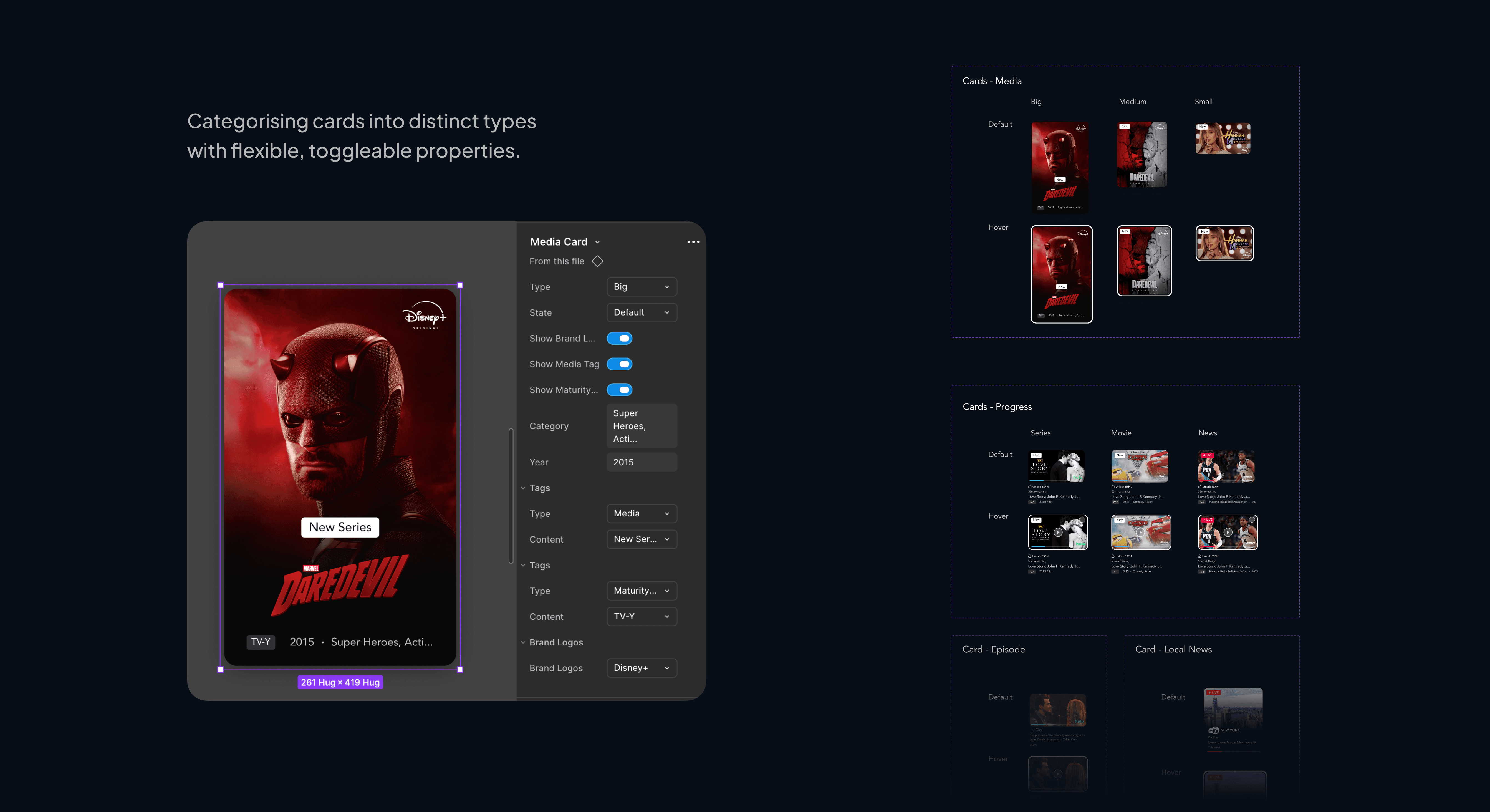
03 Then, we built patterns! Templates consisting of multiple components to quickly design pages.
Here's how it looks like on Figma while designing with Patterns.
user testing
Testing with real designers showed us gaps in clarity and the need for responsive design.
We conducted 3 usability tests with designers where asked them to recreate the home page using the Rafiki UI Kit.

Key Insights
Unresponsive sizing of elements
While interacting with components & patterns, we noticed that the designers weren't able to fit it to the screen of their choice. We fixed those elements.
Spacing should be defined more clearly
Although we had spacing variables & didn't have guidelines yet, they didn't know how to use them. We introduced semantic spacing tokens as well for margins & padding.
A few missing elements but easy to find!
We closed a few gaps in the UI Kit, but all designers were able to find elements easily validating our file structure & naming conventions.
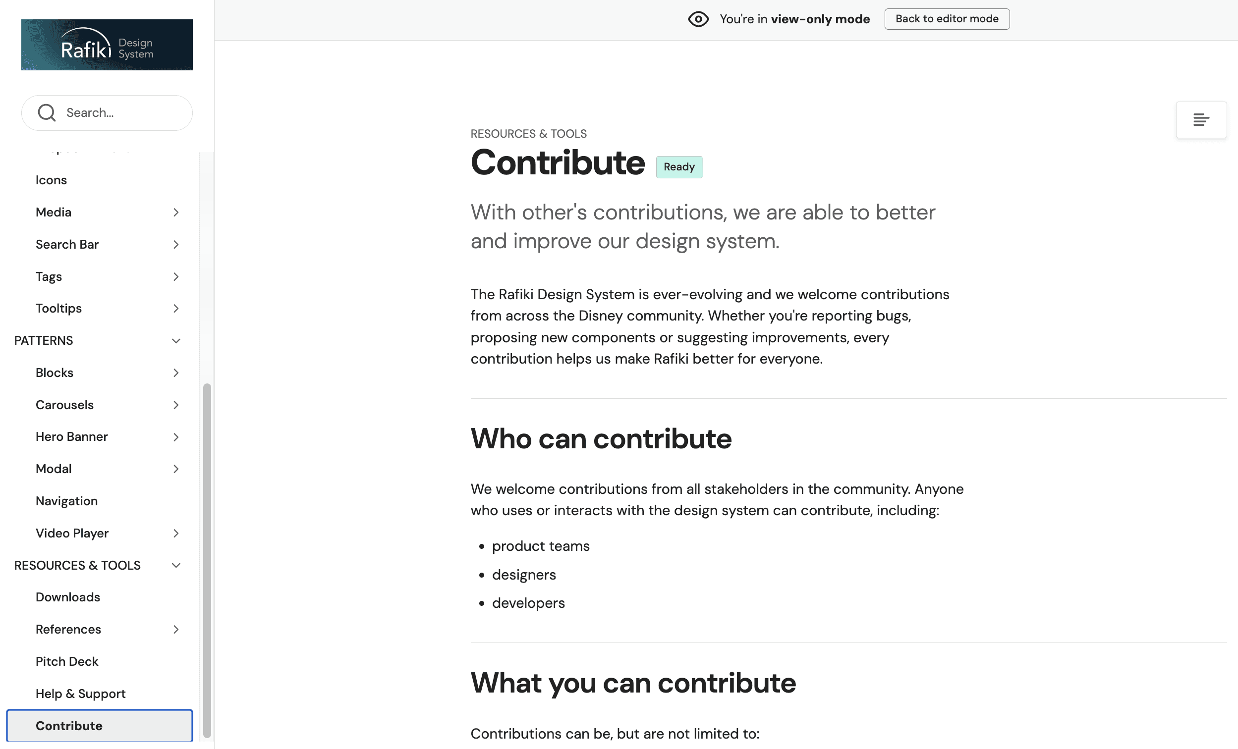
documentation
One place for every design decision. Rafiki's full documentation lives on ZeroHeight.
01 Variants, usage guidelines, and smooth onboarding for every foundation, component, and pattern, all in one place.
02 Each element has its own accessibility guidelines.

03 Making it easy for stakeholders to contribute to the system!
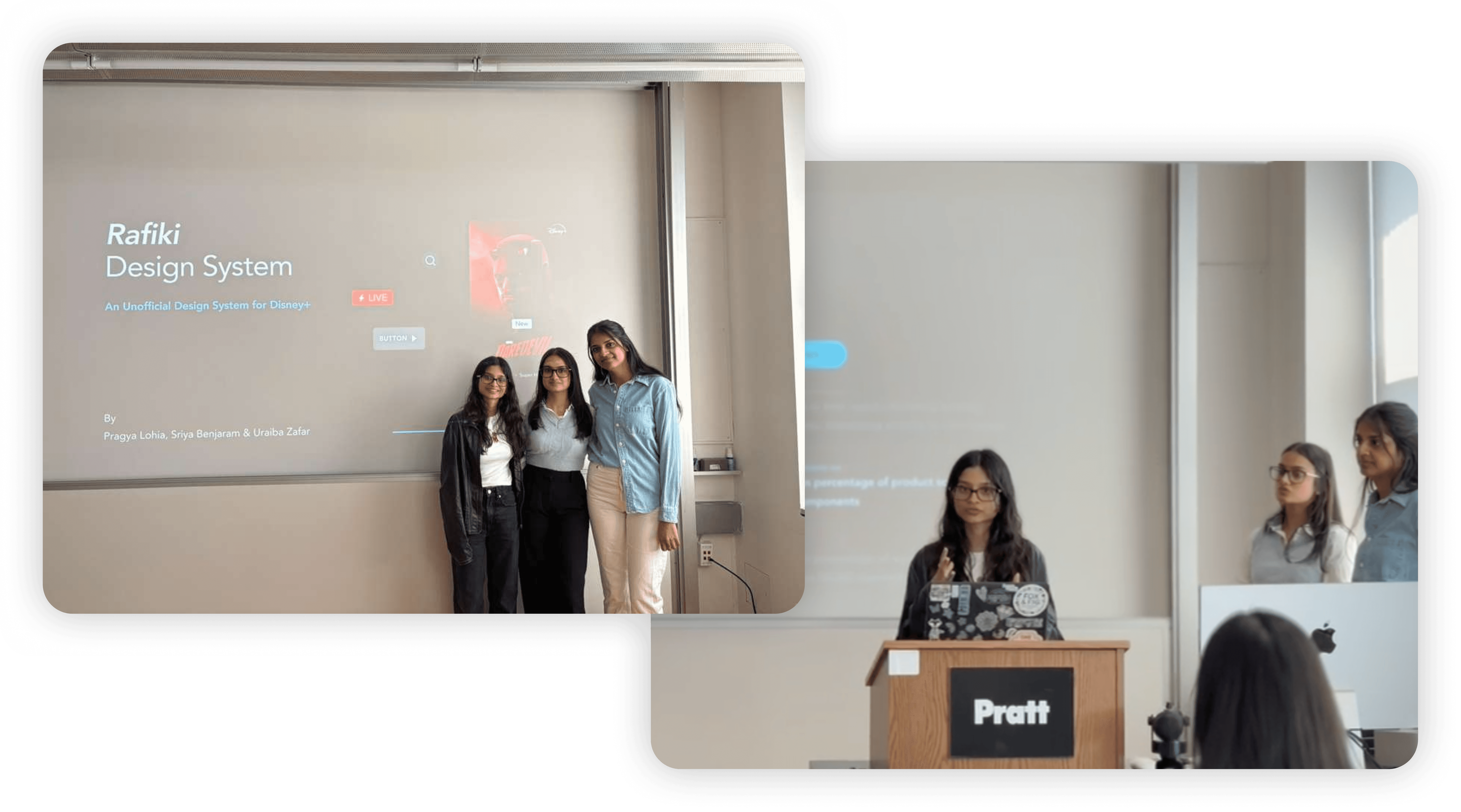
the final pitch!
We pitched Rafiki to our class as if they were Disney's stakeholders!
The pitch involved the need for a design system for Disney+, how users, designers & developers would benefit from this product, and how we envision the success after launch would look like.
How'd it go?
The audience loved how we explained the problems through personas. It helped them get into those roles & understand the issues.
Having a plan with the success metrics laid out made the design system more convincing to adopt.
They enjoyed our delivery, it made the pitch more engaging.
find them here
Rafiki UI Kit on Figma Community

Rafiki Design System on Zeroheight
what did i learn?
🎯 Know the problem before you build the system
A design system is only as strong as the problems it solves. Without direct access to Disney+'s internal teams, we had to infer inconsistencies from the live product and make assumptions about the decisions behind them. It was a reminder that the best systems are built from the inside out, rounded in the culture, constraints, and decision-making patterns of the organisation they serve.
🔃 Iteration is not inefficiency. It is the process.
Some of our strongest decisions came late. Foundational tokens we thought were complete turned out to have gaps we only discovered once components were being built on top of them. Going back to fix them felt like setbacks in the moment, but each loop closed meant one less crack in the system. Iterative working is not about getting it right the first time, it is about making sure nothing is left unresolved.
i had a great time working on this project with my team - Pragya & Uraiba!
big thanks to Prof. Craig MacDonald for being such a helpful mentor throughout the journey :)
Hop on to a bigger screen to unlock the complete case study and for the best experience! 🗝️ 🤩


